 Measuring Progress and Inspiring Action in Infrastructure
This report measures the progress of infrastructure in the Southern Arizona region. It highlights areas where the region has excelled and points out areas that still need work. The MAP aims to measurably improve Southern Arizona by data-driven collective civic action and education. Data and analysis presented in the MAP Dashboard Infrastructure category facilitate this by identifying key trends, tracking performance, and informing future policy decisions. The MAP measures progress and inspires action by providing our leaders with facts that inform their decision-making on key issues in Southern Arizona. As the MAP Dashboard celebrates its 10th anniversary, we will look at how infrastructure has improved (or not) in our region over the past decade.
Go to Chart Infographic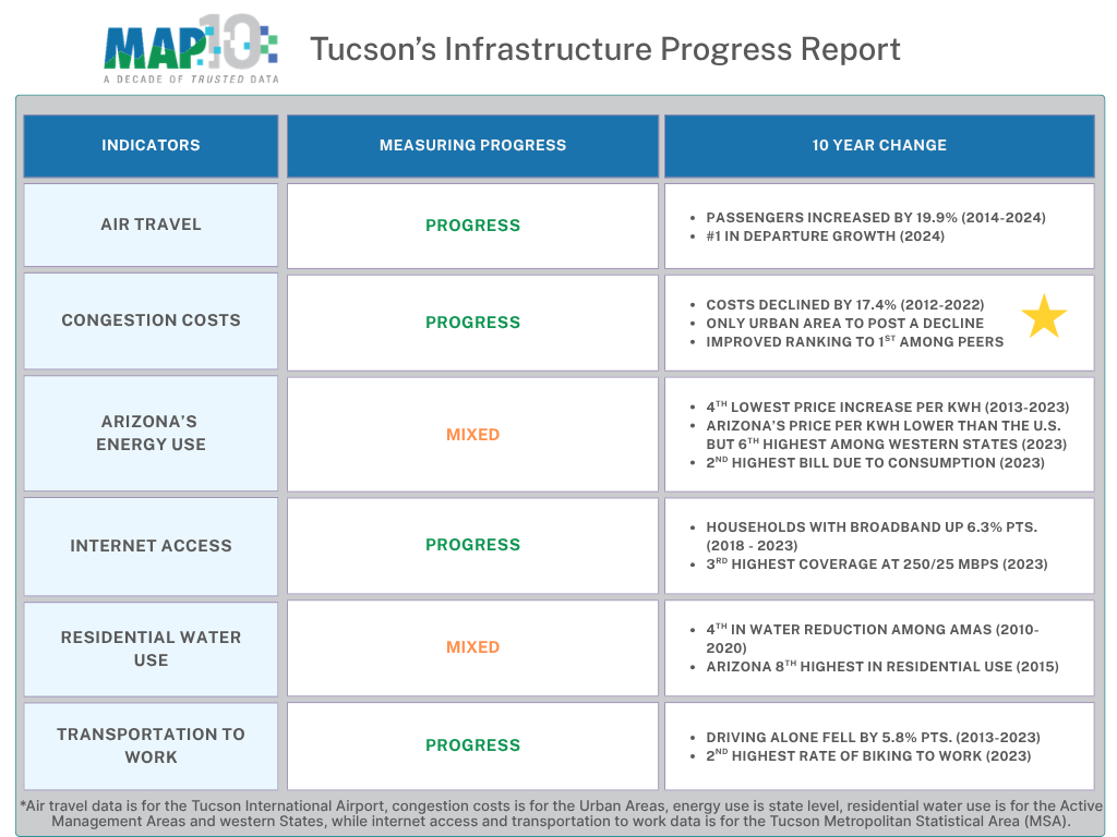
Key Changes Over the Past Decade in Infrastructure
Key changes over the past decade are highlighted below for the MAP's infrastructure indicators using an interactive graphic. The MAP Dashboard compares the Tucson MSA to other peer regions around the West. In some cases, only select regions are included in the interactive graphics to emphasize Tucson’s change. Data for all areas are available under each indicator’s core landing page. They are linked throughout the article.
Air Travel
In 2014, the Tucson International Airport (TUS) had a passenger growth rate of 1.1%, ranking it fifth among its peer airports. Palm Springs experienced the fastest passenger growth in 2014, at 9.0%, while Colorado Springs had the slowest growth, with a decline of 5.3% (Figure 1). In 2024, the Tucson International Airport’s ranking improved, tying it with the Colorado Springs airport for third place with a 3.9% growth rate in passengers. The Tucson International Airport served 3,817,659 passengers in 2024. That was above pre-pandemic levels and a 19.9% increase from 2014. In 2024, the Tucson International Airport had an average of 53.8 departures per day. That was an increase of 13.1% over the year, placing the Tucson International Airport with the fastest growth among peers.
Figure 1: Growth Rate in Number of Passengers Over the Past Decade (2014 - 2024) Go to Air Travel Graph
Congestion Trends
The MAP added the new Congestion Trends indicator in 2024. In 2012, the Tucson urban area had the fourth-lowest congestion cost per auto commuter at $897. A decade later, the Tucson urban area had the lowest congestion cost per auto commuter at $741 (Figure 2). That was a reduction of 17.4% or $156. In 2012, El Paso, Colorado Springs, and Salt Lake City had lower congestion costs than Tucson. The San Diego urban area had the highest costs at $1,619. A decade later, the Tucson urban area had the lowest costs, while San Diego continued to have the highest congestion cost. Additionally, the Tucson urban area had the second-lowest annual delay hours per commuter in 2022 at 39.
Figure 2: Annual Congestion Costs per Auto Commuter Over the Past Decade (2012 - 2022)Go to Congestion Costs Graph
Energy Use
In 2013, Arizona's average monthly electricity bill was $122.85 (Figure 3). That was the second-highest among the 10 western states. Arizona's high average monthly electricity bill is driven by consumer demand, not prices. In 2023, 10 years later, the average bill had increased to $148.44. That increase was modest compared to the nation and many western states. In 2023, Arizona's price per kWh of electricity was 14.0 cents, well below the national price of 16.0 cents. Over the last decade, Arizona's price has increased by 19.7%, while the nation has seen an increase of 31.9%. Arizona's neighbors, California and Nevada, have seen price increases of 81.8% and 40.2%, respectively. Texas had the highest average monthly electric bill in 2013 and 2023.
Figure 3: Average Monthly Residential Electricity Bill Over the Past Decade (2012 - 2022)Go to Energy Use Graph
Internet Access
The Tucson Metropolitan Statistical Area's percentage of households with broadband access increased by 6.3 percentage points between 2018 and 2023. Tucson's rate of 86.9% in 2018 placed it with the seventh-highest rate among peer MSAs. Tucson retained the seventh-highest rate of households with broadband in 2023. Colorado Springs posted the highest rates in 2018 and 2023, while El Paso had the lowest in 2018 and Albuquerque in 2023 (Figure 4). A ten-year trend was not available for this dataset. Additionally, the MAP added new information on the availability of residential broadband at various speeds in 2024.
Figure 4: Percent of Households with Broadband Internet (2018 - 2023)Go to Energy Use Graph
*Values are interpolated. That means the values are filled between the actual valid data points. When paused, the visualization only displays actual values.
Residential Water Use
The Tucson Active Management Area (AMA) ranked in the middle of the AMAs in residential water use at 126 gallons per capita per day (GPCD) in 2020 (Figure 5). The Tucson AMA includes portions of Pima, Pinal, and Santa Cruz counties. Over the past decade, the Tucson AMA has reduced residential water use by 15 GPCD or 10.6%. Comparatively, Arizona ranked eighth among western states in 2015, which was the latest data available. Residential water use by Tucson Water customers was significantly less in 2020 at 83 GPCD. In addition to the new information on the AMAs, the MAP also added data on water supply by source in 2024.
Figure 5: Residential Water Use Over the Past Decade (2010 - 2020)Go to Water Use Graph
Transportation to Work
In 2013, the Tucson Metropolitan Statistical Area (MSA) had the sixth-lowest rate of those who drove alone to work at 76.5% compared to peers. That rate fell to 70.7% in just a decade, a drop of 5.8 percentage points. However, that improvement wasn’t enough to keep Tucson from falling a spot in the rankings in 2023 compared to peers (Figure 6). Over the past decade, Portland has consistently posted the lowest rate of those who drove alone to work. The transportation to work indicator includes multiple modes of commuting to work, including work-from-home rates, which have skyrocketed since the pandemic.
Figure 6: Percent of Commuters that Drove Alone to Work Over the Past Decade (2013 -2023)Go to Transportation Graph
*Values are interpolated. That means the values are filled between the actual valid data points. When paused, the visualization only displays actual values.
Why is it important?
Infrastructure is a key component of a region’s overall prosperity. People rely on transportation and communication networks to access employment, goods, and services. Additionally, businesses depend on infrastructure to provide access to trade, raw materials, labor, and other inputs to production. Natural resources such as energy and water can impact a region’s long-term sustainability.
Learn More
To learn more about the infrastructure category on the MAP Dashboard, visit the overview page. You can view more data and information about the six indicators in the infrastructure category by clicking on the links below.
Stay tuned for articles measuring the progress of each of the MAP’s six categories.